So, it was just Labor Day Weekend, and while we all should be out NOT laboring, I spent part of the long holiday weekend thinking about a few of my favorite FRED charts.
Rather than include all of my favorites, I set a challenge for myself: Limit the list to the three most telling charts:
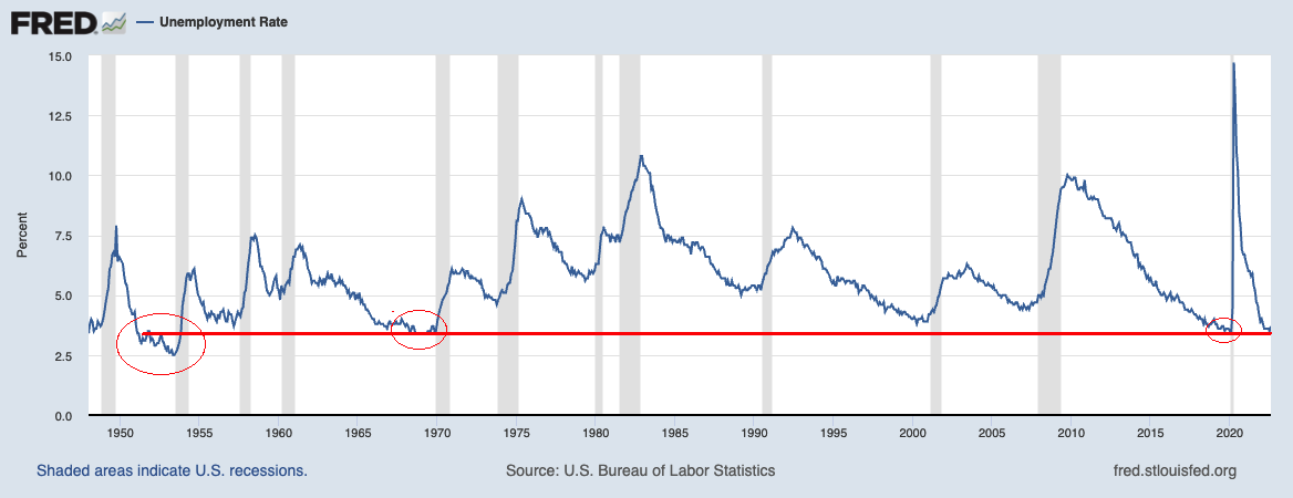
U3 Unemployment Rate: When has unemployment been lower than today? Hardly ever, but there are 3 specific eras: Following the long, slow post-GFC recovery, just before the pandemic, January 2020 U3 was at 3.5%; Prior to that you have to go back more than a century to October 1968 to May 1969 when the Unemployment rate was at 3.4%; before that, it was soon after WWII, in 1952-53, when Unemployment was under 3%(!) bottoming in June 1953 at 2.5%.
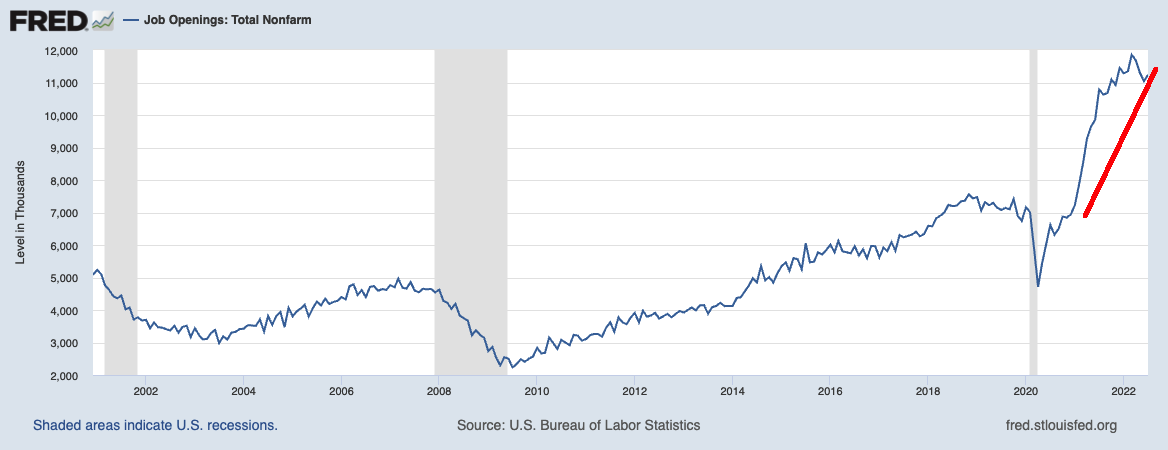
Job Openings: Total Nonfarm: Consider how many jobs remain unfilled today and you have a sense of so many other issues in this economy: Supply chain snarlls, leading to goods shortages, leading to inflation, etc. The good news is that this post-pandemic spike looks very aberrational and (hopefully) temporary. To fix this is simple but not easy: More immigration, COLA minimum wage, etc.
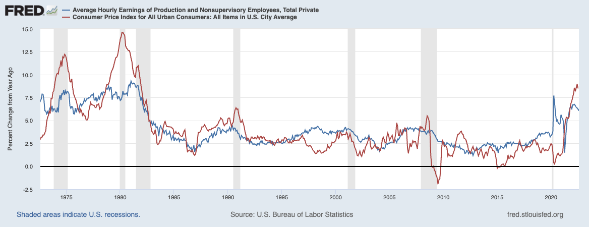
Wages (relative to Inflation): Wages generally have not kept up with inflation over the past 50 years. (This is especially true for the bottom half of earners). The chart below shows areas where inflation is above wages, and that means workers’ salaries are lagging behind their living expenses. Making matters worse, much of the time when inflation is below hourly wages, it is due to a recession along with steep increases in Unemployment. (To see wages alone w/o CPI, see this FRED chart).
I am hard-pressed to find three other charts that are not only as instructive about the labor market but also so informative about the entire current economy.
Any suggestions? Share them here.
Previously:
The Great Resignation Is Long Over (July 27, 2022)
$1.395 Trillion Peak Unemployment Insurance (March 4, 2022)
Elvis (Your Waiter) Has Left the Building (July 9, 2021)


