Data can easily mislead, but they can also inform. Indeed, much social and economic reality cannot be adequately grasped without quantitative data that are thoughtfully classified, skillfully assembled, and carefully interpreted. And when data are displayed in the form of graphs, the information conveyed can be enormous. Such ‘pictures’ are indeed often worth a thousand words, or more.
Presented below are graphs that bust many myths about international trade and the U.S. economy. All are assembled from data that are publicly available, mostly from the websites of U.S. government agencies such as the Bureau of Labor Statistics and the Bureau of Economic Analysis. The first four of these graphs were created by my former George Mason University student Jon Murphy, who now teaches economics at Western Carolina University. Above each graph is a short explanation of that graph’s chief lesson.
The Pictures
An important lesson conveyed by the graph below is that the number of jobs in an economy isn’t fixed. As revealed here, the U.S. civilian labor force today (2022) is about 160 percent larger in number than it was in 1950. So, too, is the number of Americans employed in civilian jobs.
The most common fear about imports is that they result in a net destruction of jobs in the home-country economy. The following graph casts grave doubt on that accusation. The growth in U.S. civilian employment from 1950 through the spring of 2022 was unaffected by the steady increase in the inflation-adjusted (that is, “real”) amount of imports coming into America. Even when the annual increase of imports itself accelerated, starting in the early 1980s, there was no discernable negative impact on total employment.
Another false belief about imports is that they reduce the pay of workers in high-wage countries such as the United States. Yet as shown below, when annual U.S. real imports began to increase at a faster rate starting in the early 1980s there was no impact on the growth in real worker pay.
Some people will protest: “The problem isn’t imports as such, it’s that imports exceed exports – the problem, in other words, is the U.S. trade deficit!” So let’s take a look.
The graph below plots the value of the annual U.S. trade deficit against U.S. civilian employment. Although the U.S. began consistently to run annual trade deficits in 1976, the negative impact on employment growth that protectionists predict did not materialize. Likewise, comparing the previous graph with the course of the U.S. trade-deficit shown below reveals that the growing trade deficit does not correspond with any long-run decline in the growth of inflation-adjusted worker pay.
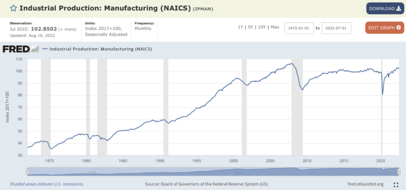
Another popular myth is that American manufacturing output has been long declining. The graph below – reproduced from the St. Louis Fed’s FRED data site – busts that myth. American manufacturing output hit an all-time high on the eve of the Great Recession. After falling during that recession, it then grew a bit before leveling off for about eight years. Manufacturing output fell again during the first throes of COVID hysteria, but has, since April 2020, chugged upward. In July 2022 this output was only three percent lower than its all-time high in December 2007, and was 21 percent higher than its Great-Recession low in June 2009.
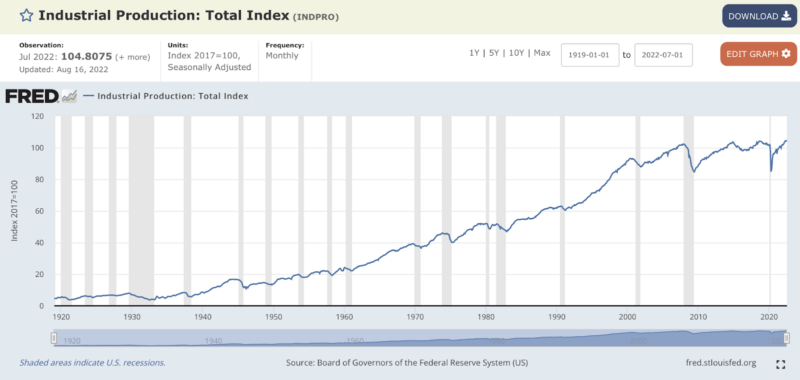
A broader measure of output is industrial production, which includes, in addition to manufacturing output, also the mining of raw materials and production of energy. Industrial production has grown steadily for more than a century. In July 2022, the latest month for which these data are available, U.S. industrial production was at an all-time high.
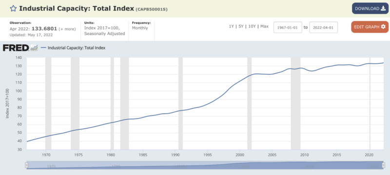
Given this reality of U.S. industrial output, it’s no surprise that, as the next graph shows, U.S. industrial capacity is also at an all-time high.
Furthermore, as the next graph makes clear, companies based in America are not becoming dangerously overburdened with debt (including with debt owed to foreign creditors).
Likewise, U.S. household net worth has also grown (at least since 1987 when FRED began compiling these data). These data, however, are not adjusted for inflation. Manually adjusting for inflation, which I did using this inflation adjuster, shows that total household real net worth in the last quarter of 2019 (just before data are distorted by COVID hysteria, lockdowns, and government spending) was 73 percent higher than it was in the fourth quarter of 2001, when China joined the World Trade Organization. In the fourth quarter of 2019, household real net worth was 182 percent greater than it was in 1987.
Of course, there are also more households in America today than there were in the past. In 2001, for example, there were 108 million households while in 2019 the number of households was 129 million. In 2019 dollars, average household real net worth rose from $700,213 in 2001 to $849,946 in 2019. Median household real net worth is much smaller than is mean real net worth. In 2019, median household real net worth was (at $67,560 2020 dollars) 9 percent higher than in 2001.
No data or sets of graphs, regardless of how carefully constructed and intelligently interpreted, can convey a complete picture of an economy. Most obviously, data such as those presented above are ‘big picture.’ They say very little about flesh-and-blood individuals or particular business firms. Yet, such data can convey important information, which is often the opposite of popular narratives about the economy, generally, and about trade in particular.


