As you might expect, volatile asset classes like emerging markets (EM, which is measured by the MSCI Emerging Markets index) tend to generate both outsized gains and outsized losses. EM topped the chart in five of the last 15 years (2007, 2009, 2012, 2017 and 2020) but were also at the bottom in 2008 and 2011. EM’s largest gain in that period was 52% in 2009, immediately following the 41% loss in 2008. Therein lies a tale!
Looking at the Standard Deviation of Key Asset Classes

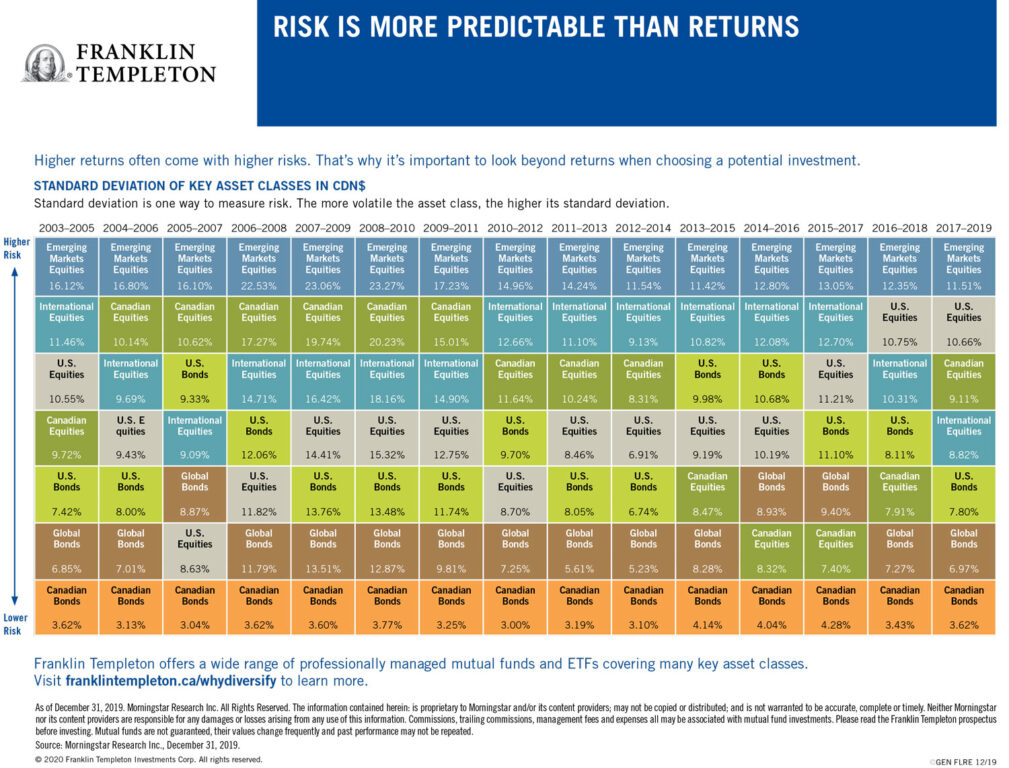
The latest Franklin Templeton online charts also include a second version titled “Risk is more predictable than returns.”
This chart notes: “Higher returns often come with higher risks. That’s why it’s important to look beyond returns when choosing a potential investment.” And it ranks the asset classes from lower risk to higher risk and here the results are remarkably consistent across almost the entire 15-year time span between 2005 and 2021.
The lowest risk in every one of the time periods covered is Canadian bonds, typically with returns of between 3% and 4% (a 4.77% high from 2019 to 2021). And consistently the riskiest is EM equities, which were listed as the riskiest single asset class from 2005 to 2019, replaced only by Canadian equities between 2018 and 2021.
Almost as consistently, the second lowest risk asset class were global bonds, while the second riskiest were International equities (MSCI EAFE index from 2010 to 2017) and Canadian equities (from 2005 to 2011.)
Looking outside of the chart
This is all valuable information, but, alas, these charts seem to focus almost exclusively on the big two asset classes of stocks and bonds, precisely the two that are the focus of all those popular all-in-one asset allocation exchange-traded funds (ETFs) pioneered by Vanguard and soon matched by BMO, iShares, Horizons and a few others in Canada.
Even these seemingly prudent broad-based diversified investments will likely show disappointing results once these charts are updated for 2022. When a classic 60/40 balanced fund, like Vanguard’s VBAL is down 13% through October 31 (I know, because I own it), you know we’re in tough times, even for conservative investors.
For me, the disappointment is that the “Why diversify” chart—like most of the asset allocation (AA) ETFs, for some reason—ignores alternative asset classes like gold or precious metals, real estate or real estate investment trusts (REITs), commodities, inflation-linked bonds and cryptocurrencies.


