Stock charts are a popular tool both for people that simply want information about a stock or an index, as well as highly active day traders looking to time their buy and sell orders. Anyone who wants to try an active investing strategy needs to know the different types of stock charts, how to read them, and what details to look for is essential for anyone who wants to try an active investing strategy.
What Is a Stock Chart?
As its name implies, a stock chart is a chart that shows information about a specific stock that’s traded on the stock market. Typically, the chart will indicate changes in the stock’s price over time, showing the rises and falls in the stock’s price.
It may also contain other information, such as the number of shares traded during various periods, when the stock paid dividends or other details.
Types of Stock Charts
There are a few main types of stock charts that people use on a regular basis. Each has pros and cons and displays different types of information.
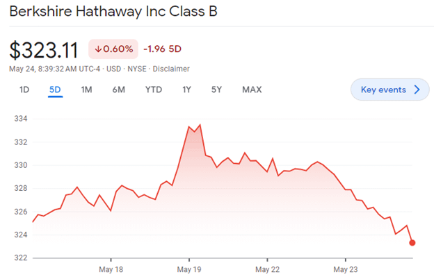
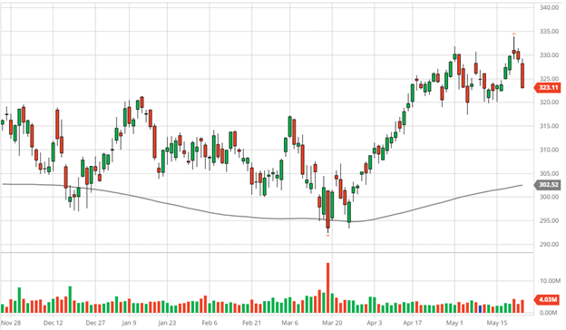
The above example is a line chart. It’s one of the simplest types of stock charts, displaying the price history for a specific company’s shares over time. It’s also one of the most popular and the one you’re most likely to see in news reports or on TV.
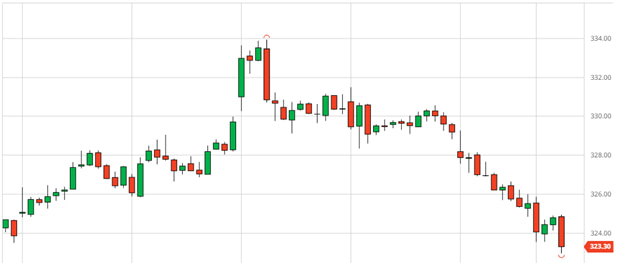
Another type of stock chart is a candlestick chart.
These charts show the range of prices that a stock traded at during a specific period, such as a 15-minute or hour-long period. Green candles indicate that the price ended that period higher than it began, while red candles indicate an ending price that was lower than the beginning price.
Candlestick charts can be good for identifying volatility or major price movements that occurred over a short period.
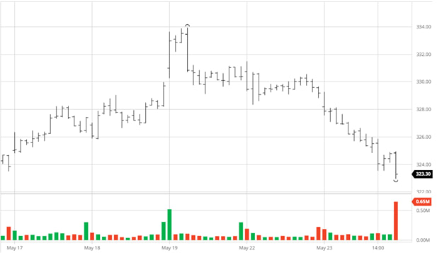
There are also bar charts. These are very similar to candlestick charts.
Like a candlestick chart, a bar chart shows the price range a share traded at during a specific period of time and indicates the starting and ending prices during that period. However, it is not color-coded, which may make it harder to read at a glance.
This example chart includes information about the trading volume as well as the stock’s price. The bars at the bottom of the chart indicate how many shares were traded during each period.
What Are Stock Charts Used For?
Stock charts have many uses. How you use one depends on your reason for looking at charts and your investment goals.
At their most basic level, stock charts are a useful informational tool. You might look up a stock chart to see how the price of a share changed over the course of a day, week, month, year, or even longer. If you own shares in a company or mutual fund, you can use a stock chart to see if your investment is gaining or losing value.
You can also use charts to compare multiple companies or stock indices. You can put the stock prices of two companies on one chart to see if one tends to gain or lose more value than the other or to compare a stock’s performance to an index.
If you’re looking to make an investment decision, you may consider using a stock chart to help you decide when to buy. If you see that a stock’s price is lower than it has been historically, you might decide it’s a good time to buy.
Active traders, especially day traders, make extensive use of stock charts to help them make investment decisions and time their trades. Many use a strategy called technical analysis to help analyze stock charts.
Technical Analysis
Technical analysis is a strategy that relies on analyzing stock charts to try to predict future changes in a stock’s price.
In particular, it involves looking for patterns in how a stock’s price has changed, its trading volume has changed, or other factors visible on its chart. Technical analysts believe that specific patterns that appear on a stock chart can be used to predict future price movements.
This contrasts with fundamental analysis, which involves looking at a company’s financial records, performance, competitors, and industry to try to determine if it is well-positioned to succeed in the long run.
Traders can use technical analysis with almost any asset that has historical price data available. That makes it popular among stock traders but also people who trade futures, currencies, and commodities.
Some traders use fundamental analysis to choose which stocks to buy and use technical analysis to identify advantageous entry points.
Moving Averages
One of the most common things that technical analysts look at when examining a stock chart is the moving average. Moving averages aim to smooth out the volatility in a stock’s price to get a clear look at long-term trends.

If you want the 5-day moving average of a stock and its previous closing prices were $4, $6, $7, $2, and $5, its moving average would be:
($4 + $6 + $7 + $2 +$5) / 5 = $4.80.
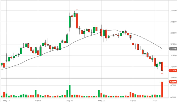
This candlestick chart shows the price movement of shares in BRK.B. The line on the chart is the 20-day moving average for the stock price. You can see how the moving average shows a steady rise even for a day after the stock’s price starts to decrease, then a more gradual fall even as the stock drops sharply.
Using a long-term moving average can provide a good sense of the stock’s long-term price trends. Popular moving averages to look at include 10-day, 20-day, 50-day, and 200-day.
Lines of Support and Resistance
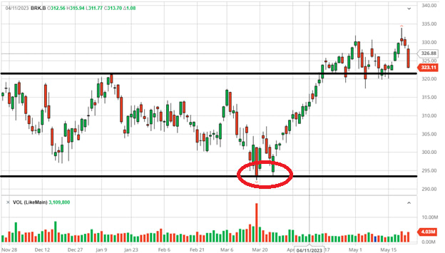
Lines of support and resistance are a popular way for technical analysts to try to predict future price movements. The idea is that certain price points are difficult for a stock to move past. Should a stock break through those barriers, it will likely continue that trend.
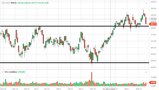
One way to identify support and resistance is to look at a stock’s price over a long period, such as weeks or months. If you see that a stock moves in a specific range, it could indicate a line of support or resistance.

Moving averages are also a popular tool for people looking to identify forms of support and resistance.
You can see that the moving average provides support for the stock’s price. When the price nears the moving average, it tends to rise rather than break below the moving average price. If it does fall below the moving average, it quickly returns to a higher level.
Technical analysts often view a stock price moving above or below a moving average for more than a short period as indicating an upcoming strong move in that direction.
Trading Volume
Trading volume is another key piece of information for technical analysts. Consider this chart.
There are many technical indicators that relate to trading volume, including:
- Trend confirmation. Rising markets tend to see rising volume, so if prices are going up, the volume of trades should rise. If prices are rising but volume is low, it could warn of a price reversal.
- Exhaustion moves. If a stock has a relatively stable trade volume and experiences a big spike in volume with a sharp change in price, it could indicate the end of a trend. The above chart might be a good example of this. Trading activity spiked on May 19th alongside a large price increase. After that, the upward price trend reversed, and the stock began to lose value.
- Volume and price reversal. If a stock has been trending upward or downward over the long term, then settles into a specific range while maintaining high volume, it can indicate an upcoming reversal of that trend.
- Breakout confirmation. When a stock breaks beyond a line of support, a rise in volume could indicate that the breakout is strong. Low volume could indicate a lack of interest in the stock, and the price move could be a false breakout.
Of course, none of these trends are guarantees, and they have to be viewed in the context of the wider environment, including factors such as general economic news or company-specific news.
Common Technical Patterns
A third way to use stock charts in technical analysis is to try to identify particular patterns in the way a stock’s price changes. Technical analysts rely on these patterns to predict future price movements.
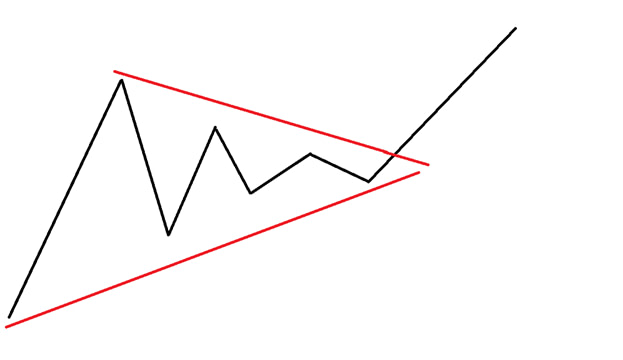
One common pattern is a wedge, which occurs when a stock’s price rises and falls, but those movements become smaller and smaller, creating trend lines that start to converge.
Once the stock’s price breaks beyond the upper point of resistance, it moves swiftly upward. If the price dropped below the resistance level, it could indicate a quick fall in price.
Related to wedges are triangles. These look much like wedges but tend to have one flat trendline and one that angles upward or downward. An ascending triangle with flat highs and rising lows is a bullish indicator while descending triangles with flat lows and descending highs are bearish.
Another example of a technical pattern is a double bottom.
In a double bottom, a stock’s price tries to push through its line of support, fails, rises slightly, then tries to push through the resistance again. If it fails a second time, that can be a bullish indicator. Double tops are the reverse, where the price tries to break through the line of resistance but fails. These are bearish indicators.

How to Use Technical Analysis
Using technical analysis is all about looking at stock charts and identifying patterns. Because the patterns are used to predict how a stock’s price will move in the near future, technical analysis is most popular for active investors and day traders.


Fundamental Analysis
Fundamental analysis is another strategy for analyzing stocks. Unlike technical analysis, which involves examining stock charts, fundamental analysis revolves around research into a company’s financial records and business situation. It looks at the fundamentals of the business’s operations.
There are some ways to use stock charts when conducting fundamental analysis. For example, a stock chart could be helpful for comparing businesses in the same industry or comparing a stock to a specific index.
Fundamental analysis tends to be about longer-term investments than technical analysis. There are two main strategies that people implement.
Value Investing
Value investing relies on buying shares in companies when they are underpriced by the market.
The first step in value investing is examining a business and coming up with a fair value for it. You may consider its position within its industry, leadership team, revenue, debts, recent profits, dividend payments, and other factors.
Investors often also look at free cash flow, price-to-book ratio, or price-to-earnings ratio to help determine a fair price for a stock.
If you determine that the fair value for a specific stock is $30, but it’s currently trading at $20, that could present a good opportunity to buy because you believe the stock is underpriced.
Growth Investing
Growth investing focuses on finding opportunities to invest in businesses that have the potential to grow. Typically, investors will examine a business to determine if it could grow at a faster pace than the competition.
Buying a growth company for a low price is less important than getting in before it experiences explosive growth. Still, you do not want to overpay for a growth stock.
If a stock’s fair value is $10 and it manages to grow to $20 per share, it’s fine if you paid $12 for it, especially if its price never fell back to its “fair” value.
Growth businesses are usually newer, smaller companies that have not fully established themselves. By contrast, value stocks are typically larger ones that have less space to grow. Value stocks are more likely to pay a dividend than growth stocks, which dedicate their resources to expanding the business.
Summary
Stock charts are a key tool for investors. They offer an easy way to see how a stock has performed in the past. They’re even more important for technical analysts, who rely on them to make predictions about future price movements.
As you invest, make sure to take stock charts into account and keep an eye out for indicators that could help you predict future price movements.


