
I read an interesting report this morning, which resonated with some other work I had been looking into earlier in the week. The Australian Council of Social Services (ACOSS) released a report yesterday (September 27, 2023) – Inequality in Australia 2023: Overview – which shows that “The gap between those with the most and those with the least has blown out over the past two decades, with the average wealth of the highest 20% growing at four times the rate of the lowest”. It is one of the manifestations of the neoliberal era and is ultimately unsustainable. Earlier in the week, I spent some time analysing the latest data from the US Federal Reserve on the distribution of wealth among US households. The US data goes a long way to explaining why the recent interest rate hikes have been inflationary in themselves.
As an aside, one of the characteristics of neoliberalism that is not often recognised is the way in which it has created schizoid welfare institutions – where key organisations that deliver or advocate for improved safety nets or poverty relief adopt internally inconsistent positions without, seemingly, knowing it.
A glaring example in Australia of this schizoid behaviour in the last few decades has been the church-based welfare organisations that were roped into tendering for contracts to deliver the government’s privatised job services disaster and became the front line troops in coercing the unemployed and reporting breaches of the income support activity tests back to government, while at the same time offering emergency food relief etc.
They became the instruments of the most pernicious treatment of the most disadvantaged in our society while preaching love and forgiveness.
Earlier this week I commented on the Federal Government’s White Paper on Full Employment release – Australia’s new White Paper on Full Employment is a dud and just reinforces the failed NAIRU cult (September 26, 2023) – and the title summarises my views on it.
I wouldn’t have expected the peak welfare body in Australia to praise the White Paper.
Well ACOSS, in the same week it published shocking wealth inequality data, did exactly that.
In its press statement (September 26, 2023) – White Paper lays good foundations for full employment, clear goals and targets are the missing planks – ACOSS was generally uncritical and didn’t seem to grasp that the ‘missing planks’ that it identified were exactly why the foundations laid by the White Paper are just more-of-the-same NAIRU neoliberalism.
The ‘missing planks’ are the logical outcome of the supply-side approach, which relies on a ever-shifting concept of maximum employment, to justify not actually pursuing true full employment.
I did several radio interviews this week where I was asked why the government didn’t actually ‘nail down’ a full employment unemployment rate.
The reason is that then they would be forced to leave the NAIRU world.
Anyway, that is a digression.
Australian inequality
The ACOSS research (in partnership with UNSW researchers) reveals:
1. “wealth inequality has increased strongly over the past two decades”.
2. “From 2003 to 2022, the average wealth of the highest 20% rose by 82% and that of the highest 5% rose by 86%, leaving behind the middle 20% (with a 61% increase) and the lowest 20% (with a 20% increase).”
3. “The overall increase in wealth inequality over the period was mainly driven by superannuation, which grew by 155% in value due to compulsory savings property investment.”
4. “the wealthiest 20% hold 82% of all investment property by value.”
The fact that it is real estate investments that is driving this wealth inequality reflects on the biased tax structure that rewards multiple property holdings with tax breaks.
One of the first things the government should do is eliminate the so-called ‘negative gearing’ provisions within the tax act which allow rich people to buy up real estate, manipulate the expenses of renting the properties so as to write off ‘losses’ against other income, while at the same time accumulating massive capital gains as the value of the properties rise.
Interestingly, and this is where the resonance with the US data comes in, the researchers found that:
… the government’s timely pandemic response reduced income inequality … In 2020-21, the average income of the lowest 20% income group grew by 5.3% compared with 2% for the middle 20% and 2.4% for the highest 20%, predominantly due to the introduction of COVID income supports.
Which tells us that appropriately targetted fiscal policy is a very effective tool for improving the lot of low-income households.
While the mainstream claim that fiscal policy is an inferior tool because, for example, households are alleged to stop spending when there are deficits because they fear higher future taxes and need to save up to pay them, the evidence exposes the fictions of these core mainstream eocnomic claims.
Further, the researchers found that:
However, during 2021-22, the removal of these income supports largely reversed those trends, restoring income inequality close to its pre-COVID level.
Incomes fell generally, but more so for those with the least. The average income of the lowest 20% fell by 3.5% compared with 0.5% for the middle 20% and 0.1% for the highest 20%.
So there is no doubt at all that the prevalence and persistence of poverty is a policy choice.
The currency-issuing government can always eliminate poverty just as it can always eliminate mass unemployment (and the two are intrinsically linked) if it wants to.
So the conclusion is that if we observe rising poverty and high unemployment the blame is directly apportioned to a policy failure.
Most people don’t see it that way and the reason is because they have been seduced by the fictions propagated by my profession.
The current Federal Reserve Distribution of Wealth release
I found some time earlier this week to study the most recent release (September 22, 2023) of the – Distributional Financial Accounts (DFAs) – which is released by the US Federal Reserve on a quarterly basis.
The DFA data integrates:
1. “quarterly data on aggregate balance sheets of major sectors of the U.S. economy” – The Financial Accounts of the United States.
2. “comprehensive triennial microdata on the assets and liabilities of a representative sample of U.S. households” – the Survey of Consumer Finances (SCF).
The data reveals some stunning developments.
The following Table shows wealth by wealth percentile group by $US trillions, with the proportion of the total in brackets.
The data shows several things including:
1. The rising grip on the total wealth that the richest American households enjoy and the declining share of the bottom 50 per cent of American households.
2. The dramatic effect that the GFC had on the poorest American households while the richest were far less impacted despite the initial cause of the crisis being sourced in the financial markets.
| Date | Top 0.1% | 99-99.9% | 90-99% | 50-90% | Bottom 50% |
| 1989Q3 | $1.76 (8.6%) | $2.84 (13.9%) | $7.64 (37.4%) | $7.41 (36.3%) | $0.78 (3.8%) |
| 2000Q1 | $4.61 (10.9%) | $7.12 (16.9%) | $14.74 (35.0%) | $14.27 (33.9%) | $1.37 (3.3%) |
| 2007Q4 | $7.79 (11.9%) | $11.14 (16.9%) | $24.95 (38.1%) | $20.67 (31.7%) | $1.21 (1.6%) |
| 2010Q4 | $6.93 (11.1%) | $10/77 (17.3%) | $24.67 (39.5%) | $19.63 (31.5%) | $0.37 (0.6%) |
| 2023Q2 | $18.63 (12.8%) | $27.15 (18.6%) | $54.81 (37.6%) | $41.74 (28.6%) | $3.64 (2.5%) |
The following graph shows the net worth ($US trillions) of the bottom 50 per cent of American households in the wealth distribution.
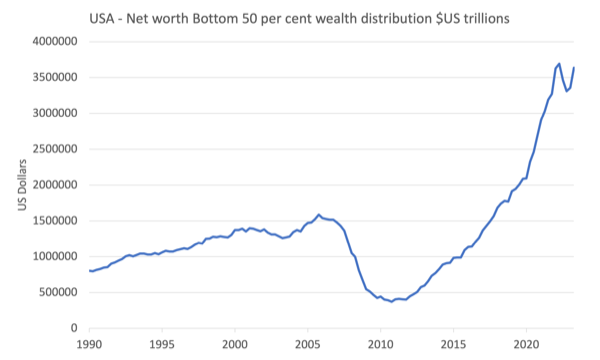
The negative impact of the GFC was amazing although the decline in net worth began well before the crisis emerged in the financial market chaos.
The peak net worth before the GFC for the bottom 50 per cent came in the December-quarter 2005.
Between then and the trough in the Decemer-quarter 2010, $US1.21 trillion was wiped off the wealth holdings of the bottom 50 per cent a 76.5 per cent decline.
Over that period, total assets for the bottom 50 per cent fell by $US0.04 trillion while total liabilities rose by $US1.17 trillion
In more detail:
1. Real estate assets declined by $US0.29 trillion while consumer durables rose by $US0.12 trillion.
2. Home mortgages rose by $US0.80 trillion while Consumer credit rose by $US0.26 trillion.
So while indebtedness was rising sharply, the assets that were backing the debt (housing) fell significantly in value.
There is also evidence that credit cards and loans were being used to purchase consumer durables in a period when income growth was relatively flat.
While this data is very complex and it will take be more time to really analyse, the other thing that comes out is the impact of the fiscal intervention during the pandemic.
You can see broadly from the graph above that there was a sharp increase in net worth for the bottom 50 per cent during the pandemic.
In figures:
1. Between the March-quarter 2020 and the March-quarter 2022, the net worth of the bottom 50 per cent of American households rose by $US1.54 trillion or 73.4 per cent.
2. Total assets rose by $US2.3 trillion while total liabilities rose by $US0.77 trillion.
3. Major asset gains in real estate $US1.3 trillion, Consumer Durables $0.49 trillian.
This period coincided with the extensive fiscal support being offered to American households.
We need to be careful though.
Most of the increase in net worth during the pandemic for the bottom 50 per cent American households came from increases in housing values, which are biased towards the upper end of the bottom 50 per cent.
That increase is on paper until they sell and if they sold they would be buying into the inflated market with much higher mortgage servicing burdens (due to the higher house prices and the higher interest rates).
Further, the lower segments of the bottom 50 per cent group are typically renters and they have been hit very hard by combination of inflated real estate values and rising interest rates.
The last point I would make at this stage is to note that there was a massive increase in total net worth across the board during the pandemic.
The following graph shows the situation from the March-quarter 2020 to the June-quarter 2023.
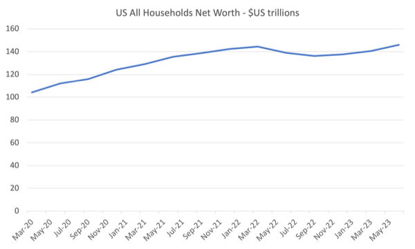
We note that:
1. Net worth rose $US40.3 trillion during this period or 36.7 per cent.
2. Total assets rose by $US42.5 trillion while total liabilities only rose by $US2.3 trillion.
3. The two major contributors to the rise in assets were real estate (up $US11.8 trillion) and Corporate equities and mutual fund shares (up $US18 trillion).
4. Of the $US40.3 trillion increase in net worth:
– $US6.4 trillion went to the top 0.1 per cent of the wealth distribution.
– $US9 trillion went to the 99 to 99.9 percentile group.
– 13.8 trillion went to the 90 to 99 percentile group.
– $US9.6 trillion went to the next 40 group.
– only $US1.5 trillion went to the bottom 50 group.
All during a period of substantial fiscal expansion.
It tells me that the fiscal expansion was poorly targetted and the wealthier American households – who own real estate and financial assets (Shares etc) made hay while the bottom 50 stood still.
Conclusion
This does help to explain why the rise in interest rates has not yet caused a major downturn in spending or economic activity.
The top 50 per cent of the wealth distribution enjoyed a rapid increase in their net worth during the pandemic and have probably increased their spending capacity as interest rates rises have rewarded them with rising incomes.
I need to examine the income distribution data attached to this dataset to make further conclusions.
But overall very interesting.
That is enough for today!
